Elegant Themes already has a blog post entitled “How to Add More Columns to Your Divi Builder Posts or Pages” which shows how to add more columns to your Divi theme. Currently, the builder maxes out at 6 columns.
The blog article’s method works fine if your modules are all equal height as shown in the example.
But, I had a situation (which is pretty common), where I wanted to have more than six columns of logos of varying height horizontally. When I used the blog’s method, the logos were not centered vertically. I did a -50% Y-axis offset to fix that, but then on mobile the logos didn’t float left correctly due to the difference in heights, and the layout was messed up.
The Solution
Here’s a simple solution to add more columns, center them vertically, and avoid the float problems. I’ll use the example of nine columns, but you can easily extend it to more using the width percentage numbers in the blog article.
First, set up your Divi modules as one big column as described in the Elegant Themes blog article. Then, add the desired CSS class to the row. In my case, I used “nine-columns”. Don’t add any of their CSS code though.
Next, in your custom CSS file or WP CSS editor, apply “text-align:center” to that CSS class like this:
.nine-columns {
    text-align: center;
}
Then, apply the corresponding percentage width to the modules (11.11% for nine columns in my case; see the Elegant Themes blog article for other widths). Instead of floating the modules, make them inline-block and apply vertical alignment as follows:
.nine-columns .et_pb_module {
    width: 11.11%;
    vertical-align: middle;
    display: inline-block;
    font-size: 0; // TO GET RID OF TINY SPACE BETWEEN ELEMENTS
}
You can vertically-align them any way you want. I needed them to be centered vertically.
Then, adjust the widths for mobile as desired. This is what I did:
@media all and (max-width: 980px) {
    .nine-columns .et_pb_module {
        width: 33.3%;
    }
}
The result is a nine-column centered row of logos that looks like this on desktop (11.11% width for each module):

On mobile, it looks like this since I used 33.3% width:

How to fix the missing bottom margin on the last section
There is one last trick I need to tell you about though. Divi thinks these modules are in one huge column as shown in the editor:
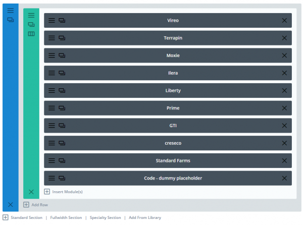
Divi’s CSS removes the margin of the last element, so as to not have double margins at the bottom of the stack.
That’s fine if they were actually displayed in one column, but that messes things up for our purposes, resulting in the last logo being lower than the rest.
To fix that, you can see that I’ve added a dummy Code module at the end. In that module’s custom CSS, I have:
display: none !important;That does the trick. Divi removes the bottom margin of this dummy element instead of our logo.
Any questions? Please comment below. Let me know if this worked for you! – Brian

I am a freelance web developer and consultant based in Santa Monica, CA. I’ve been designing websites using WordPress and from scratch using HTML, CSS, PHP, and JavaScript since 2010. I create websites and web applications for businesses, nonprofits, and other organizations. I have a degree in Electrical Engineering (BSEE) from California Institute of Technology and a degree in Engineering Management (MSEM) from Stanford University.
Please Leave a Question or Comment