Many people who use the WordPress Divi Accordion Module want it to start out closed by default. Every WordPress client I have who uses the Divi Accordion has asked for it, and there are many people online asking about it.
The way it works now is that the first element of the accordion defaults to open, which looks about as strange as always having one of your dresser drawer open in your bedroom. Unlike other solutions online, my solution uses no JavaScript – only Divi elements and some CSS!
Existing Solutions
One way around this is to use multiple Divi Toggle Modules, but that doesn’t behave exactly the same as an accordion, as they don’t close automatically when another is opened.
If you look for other solutions online, you’ll find a bunch of JavaScript fixes to make the accordion default to closed. That was my first approach as well. But, some of these solutions don’t work anymore (broken in an update), and any JavaScript solution that works today is in danger of going obsolete in a future Divi update.
I did find a paid plugin called Divi Booster that adds the ability to set the accordion to start out closed. Just note this is a paid plugin and I have not tried it myself.
I’ve found a drop-dead simple solution that does not involve JavaScript (or any other programming) and will never go out of date!
The Solution: Make an Invisible First Row!
The solution I came up with is to make a dummy first row which is invisible!
After you create your regular accordion items, create one with the title of “Invisible” (actually, it can be called whatever you want).
Go to the Custom CSS tab for that item and scroll down to Toggle Title. Enter “display: none;” here as shown below.
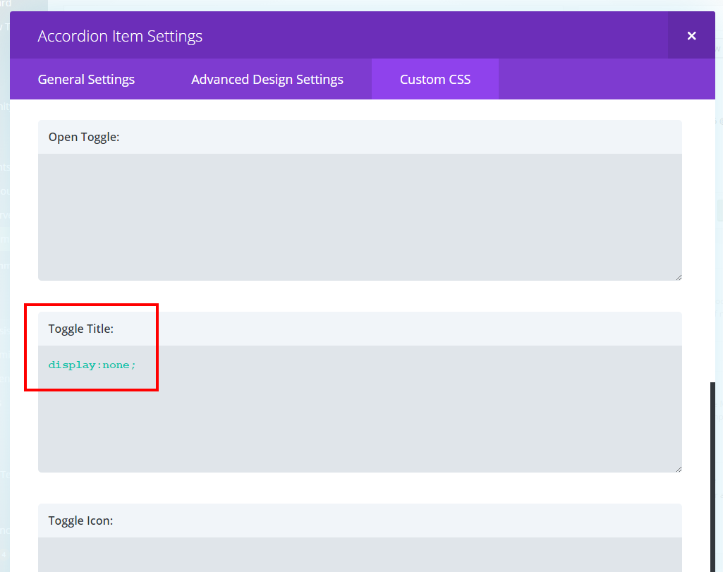
Save the item.
Next, drag it to the top of the Item list so that it is first as shown below:
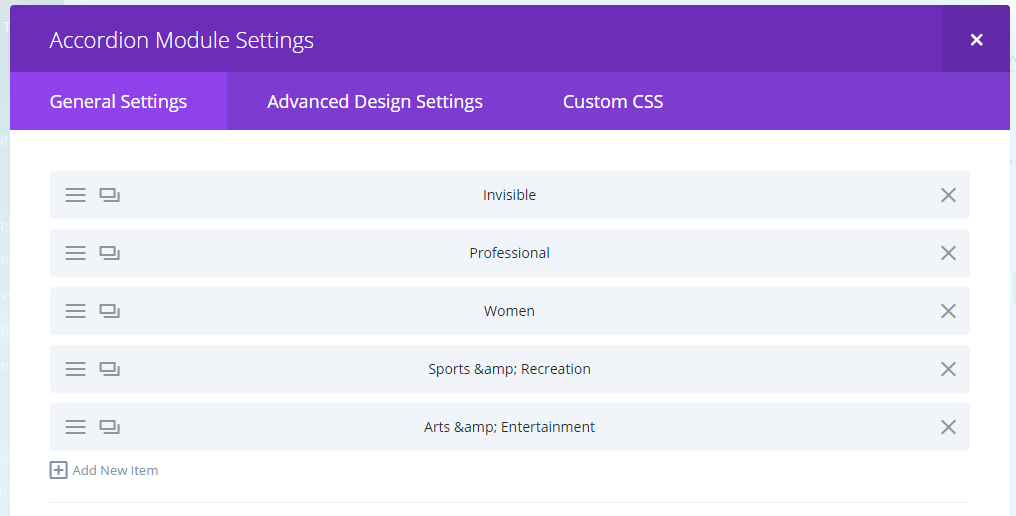
Save the module and the page.
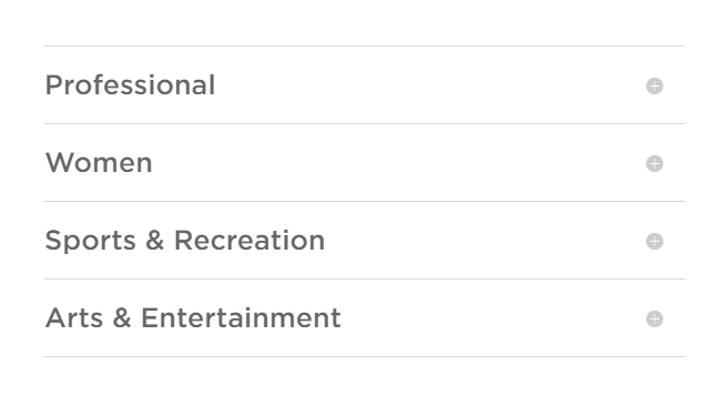
Voila! The accordion should appear closed when you go to your site! Check out this screenshot:
Now, depending on your theme’s styling, there might be some padding that is present in the invisible first row. Use CSS to set padding, height, etc. to zero in the first row’s CSS section if necessary.
How it Works
In reality, the first item of the accordion is open. But, it’s invisible, so the real accordion elements that you care about all look closed!
Clicking any visible element will open it as usual. No one will know there’s an invisible one there!
As a bonus, you get a line on top, which is something that I think makes it look nicer. If you don’t like it, you can “display:none” the entire first row (not just the text).
Bonus – How to Make a “Close Accordion” Button
The other thing that everyone asks for is the ability to close an accordion element by clicking it again. Right now, the only way to close one is to open another. There’s no way to close all elements in the default accordion once you’ve opened one.
There is a paid plugin called Divi Booster that lets you close an open accordion item by clicking it again (which is really what we want), but I haven’t tried it yet. They also supply the code to do it yourself.
You can also use a variation of the technique I described above to create a “close all” button. Simply create an accordion item with no content, but with the title, “Close All” (or whatever you want the button to be called).
I recommend styling it differently to make it look more like a button. I added CSS to the Toggle Title area of the Custom CSS section to make the font smaller and lighter than the other accordion titles.
Finally, hide the plus button by adding “display:none;” to the Toggle Icon area of the Custom CSS section of the item.
Voila! This accordion item will behave just like a “close accordion” button. But, it’s just an accordion item with no content!
Increasing Accordion Open/Close Speed
This is another huge problem with the Divi Accordion and Toggle modules – they open way too slowly! Unfortunately, these times are not adjustable in the admin; they are hard-coded in JavaScript files, so they can’t be overridden with CSS.
Please get on chat with Elegant Themes to request adjustable open/close times!
Elegant Themes, please get on this! Until then, hope these hacks are helpful.
Let me know in the comments what you think. – Brian

I am a freelance web developer and consultant based in Santa Monica, CA. I’ve been designing websites using WordPress and from scratch using HTML, CSS, PHP, and JavaScript since 2010. I create websites and web applications for businesses, nonprofits, and other organizations. I have a degree in Electrical Engineering (BSEE) from California Institute of Technology and a degree in Engineering Management (MSEM) from Stanford University.
Discover more from Web Developer Tips and Tricks
Subscribe to get the latest posts sent to your email.
Please Leave a Question or Comment
Is there an easy way to have one of the accordion items open? For example, I have 10 accordion items on a page but I want to have item 3 open and the rest closed.
Yes, use JavaScript or jQuery to click the item that you want to be open. For example:
jQuery(document).ready( function() {
jQuery(“.et_pb_accordion_item_2″).click();
});
This should open the third accordion item, though I have not tested this code! – Brian
Nice workaround that avoids JS that often breaks with an update
Since Glutenberg–I don’t know why–you have to add display none to the main element too
I don’t have Gutenberg running, but I find it necessary to do that too.
Thank you soooo much.
THANK YOU THANK YOU
sweet ! that is just so clever and quick ! Tanks !
This is soo clever! Thanks
This didn’t quite work for me. I still get a border around the invisible toggle. I’ve tried adding “border: 0;”. But this doesn’t seem to have any effect. I also tried “border: none;”. No effect either.
Please advise. Many thanks.
I figured it out. By scrolling down to “Main Element” in Custom CSS and putting in there, “display: none; border: none;”. That seems to work better.
You can also just make the border the same color as the background.
Thank you!
This actually lead me to making the following related customizations to use the top row as a Header.
In the “header” row, set Icon, open and closed backgrounds to the same color. Then added the custom CSS Border: none; to Main Element (thanks, Alyssa below!) and both text-align: center; and font-size: 200%;
With all that set, your first row will now act as a header and the accordion will appear to start closed!
Thanks again!
Very good little header solution .. thanks
Great idea but the invisible toggle is outlined and therefore visible but empty
ah nevermind border: 0; did the trick :)
This was a great tutorial. I was trying to figure out how to get the accordion to start out closed. Such a simple solution, but it worked. Thanks!
Glad my article was helpful to you! Thank you for sharing!
Brian